Sometimes the out of the box Power Apps components just don’t cut it. Maybe you want a more personalised look that matches your brand, need extra logic that goes beyond the capability of the standard component, or you need to integrate with third-party services. That’s where building your own custom PCF component comes in – it’s easier than you might think!
I’m going to run from start to finish on the whole process together and explain each step in detail, so that you understand the why as well as the how. I also have a quick reference section at the bottom so that once you’ve read through, if you need the key information you can use this when referring back. Our component example can be found in my github page here.
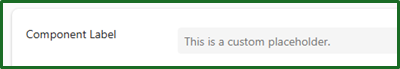
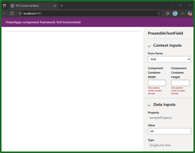
We will build out a simple component that has been styled to look exactly like an out-of-the-box microsoft component, but with the additional functionality of adding in custom placeholder text before you type. It will look as it does below.
We will break this down into the following stages to follow along:
- System Setup
- Creating your project
- Building your component
- Deploying your component
- Using your component
- Quick Reference Guide
1. System setup
Before you start any development, we will first need the right tools. If you have done this before, you can skip this step, though I recommend running through just to make sure.
-
Download and install visual studio code
- Download Visual Studio Code - Mac, Linux, Windows
- This will be the main IDE we will be using for creating our component
-
Install the power platform tools extension in Visual Studio Code. This includes all the packages and libraries needed to build our component.
- This can be found within the Visual Studio Code marketplace
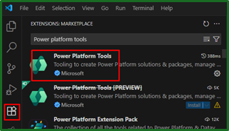
- This can be found within the Visual Studio Code marketplace
-
Download and install Node.js
-
This is will be used to create the component dependencies as well as do the actual building. It will be used from the Visual studio terminal, just like an extension.
-
- During installation, a popup may appear prompting the installation of additional components. Allowing this can help avoid potential issues later.
- This process will open PowerShell and install extra components, which typically takes a few minutes.
- During installation, a popup may appear prompting the installation of additional components. Allowing this can help avoid potential issues later.
-
You will need to reboot your machine after this
-
-
Download and install .NET
- Browse all .NET versions to download
- This will help us later deploy our solution.
2. Creating your project
Now that we have installed all the tools above, creating the project itself is straightforward. We will be building it from a template with a few commands.
-
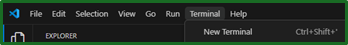
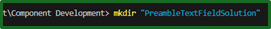
Open Visual Studio, in the terminal navigate to a directory where we will be building out the component. In this case we will be building it in a folder called “PreambleTextField”.
- If you cannot see the terminal, we can open one from the terminal menu bar.
- You can change directory with the following command:
cd ‘FILE PATH'
- If you cannot see the terminal, we can open one from the terminal menu bar.
-
Run the following command to create the initial component files from a template. These will later be edited in the “Building your component” section.
-
pac pcf init --namespace YOURCOMPONENTNAME --name YOURCOMPONENTNAME --template field
-
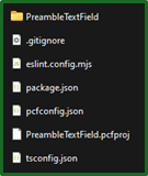
You should now see some configuration files in your chosen location
-
-
As eluded to from the previous step, we should now create our code dependencies with the following Node.js command. This is essential to build and test our component later.
npm install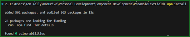
- If you get an “Unauthorized” error, you need to change allow for scripts to be run by your user. This can be done in PS with the following command
Set-ExecutionPolicy -Scope CurrentUser -ExecutionPolicy RemoteSigned
-
We should now be in a good position to test the template component
-
Run the following command to test the component locally.
Npm start -
We can now see the bare bones beginning of what will become our component. It doesn’t look like much, but we will build this out in the next section.
-
We should use this command all throughout this guide to both confirm our changes as well as confirm we haven’t broken made a mistake and broken something.
3. Building your component
Now that we have our template created, we can move onto building the component logic and styling. This aspect of the process will differ a lot more depending on the type of component we are creating, but we will run through this below.
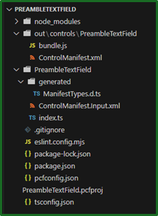
If we haven’t already opened the component environment itself in VS Code, we should do this now. You will know this if you can see something similar to the following in a left hand pane of the application:
To open it up, in CMD make sure you are in your component folder and type Code . (don’t forget the dot!).
This should open up your Visual Studio Code application with the context of your component pre-loaded and should look similar to the above screenshot.
This looks like a lot. But don’t worry, you only really need to be thinking about the following files:
- ControlManifest.xml
- Index.ts
We will be running through exactly what these files do and breaking down each aspect of the code so that we know how to edit it to any scenario.
ControlManifest.xml
This file is basically like a recipe for your custom component, defining exactly what the component is made up of. These are the essential tags that a component will not work without:
<manifest><control><resources>
These other tags are optional, but add extra features, or clarity:
<property><events><external-service-usage><feature-usage><data-set><usage><accessibility><experimental-features>
We will run through these tags that make up the XML file, with examples so that when it comes to building out our own component, it can be altered depending on the situation. Knowledge of how it works is much more useful than blindly following an example.
<Manifest>
This is the root tag that contains everything, defining it as a manifest file.
<Control>
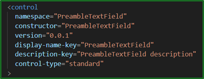
This control tag essential defines what the component is called, it contains couple of different important properties as follows:
| Property | Description |
|---|---|
| Namespace | This is a folder/group that your component belongs to, to help organise components. It may be useful when building multiple components or working in a team. |
| Constructor | This is the actual name of the component class in your typescript code. Note, that this should match the name in your .ts file (we will go into that file later). |
Those two properties together is what uniquely identifies your component.
| Property | Description |
|---|---|
| Version | Does what it says on the tin |
| Display-name-key | This is a reference to the component name displayed in Power Apps, it cannot contain any spaces. The actual text can be edited in a separate .resx file, likely in a /strings/ folder. |
| Description-key | This is a reference to the component description that is displayed in Power Apps, it cannot contain any spaces. The actual text can be edited in a separate .resx file, likely in a /strings/ folder. |
| Control-type | this defines what type of component you will be making. Here it is standard, which is most common and is a visual control. Other types are virtual and dataset, which are non visual; used for logic or data manipulation and dataset; for lists/tables of data, respectively. |
<Resources>
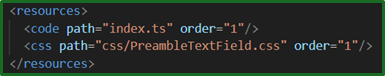
This tag points us in the direction of our pots and pans needed to complete the recipe. Pointing our component to the files needed to work as expected. Including CSS files, Typescript or JavaScript files, other images or font assets etc. Like a shopping list for our recipe.
Different tags would be used based on the type for resource, for example here we are using <code> and <css>. We may also want to use <image>, <font>, <resource> (for other generic files such as JSON, SVG etc.)
The order may also be altered to control when each of the different resources load in, which may be useful for logic.
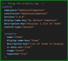
<Property>
If we were to keep with the recipe analogy, our property would be our ingredients. Property tags define the inputs and outputs of our component; what data we have to work with. For example in our component we defined 2 properties, one column input and another placeholder text.
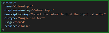
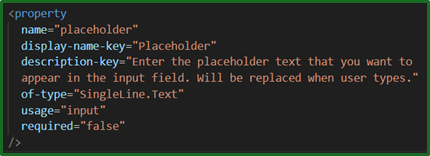
A property is required to be made up of the following:
| Property | Description |
|---|---|
| Name | |
| Display-name-key | |
| Description-key | |
| Of-type | This defines what type of data the property holds. This could be: - SingleLine.Text - Whole.None - Decimal.None - TwoOptions - Currency.None - Lookup.Simple |
| Usage | This tells Power Apps how the data is obtained. This could be: - Input – The value is set in the configurable Power Apps properties - Output – Value is sent back to the app, for example a calculated result. - Bound – Linked to a datasource, such as a column in a table. There can only be one bound property per component. - Global – Shared across all instances of the component. - Required – A true/false property. Defines if this property must be set for the component to work. |
Some optional properties are:
| Property | Description |
|---|---|
| Default-value | Sets the default value if it is not already defined. |
| Is-dataset | True/false, used if the property is a collection of records such as a table. |
| Is-collection | True/false, used if the property hold multiple values such as an array. |
| Is-raw | True/False, used if the property is JSON or unprocessed data. |
<events>
Events are the cooking timers that tell us how long everything needs cooking for. They define the signal that the component will send to the power app when an action happens, for example a click of a button or changing a value. We haven’t build this component with events in the XML file (we put ours in the .ts file), but here is an example of what it may look like if we did.
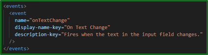
At this point, the properties shown are self explanatory. By putting this in our XML file, we are defining the event – essentially letting our power app know that it may receive an event like this in our component. This will then later be triggered in our TypeScript code.
The following tags are used in more specific scenarios and will not be in our example. But I will run through them so that we are aware, but briefly because I’m getting hungry with all this recipe talk.
<external-service-usage>
This tag is used to list external domains that our component connects to. For example, it may be used if we are calling an API or calling external images. It would use properties such as enabled="true" or "false" and url="https://example.com"
<feature-usage>
This tag enable advanced platform features such as file upload, camera access and barcode scanning.
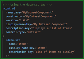
<data-set>
This tag enables the component to use a dataset such as a table or list and enables special features such as sorting, filtering and pagination.
Hopefully this brings up questions, it certainly did for me because dataset can be defined in the <control> tag in the control-type attribute and also in the <property> tag – so when do I use one or the other? Or all?
The <control> control-type=”dataset” should be used for all datasets, including this one. If you are building a component for a dataset, that should be used. It declares to the system that this component is designed to work with a table of data. But when it comes to <data-set> or <property is-data-set=”true”>, either one can be used – but not both. They define the properties of the dataset.
I recommend using the <property> tag as it allows for better flexibility and is better future proofed for new components and is more in line with the other properties. Though the <data-set> is still full supported at the time of writing this.
Here is an example manifest of the two options to help solidify this:
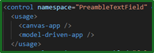
<usage>
This tag tells Power Apps where your component is allowed to be used, in a canvas app or model driven app. This is optional and if it is not specified, it is assumed that the component is available everywhere. However, best practice would be to specify this. Here is an example of what this should look like:
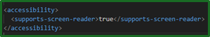
<accessibility>
This tag is used to declare what accessibility features your component supports. Currently the only official features available are screen readers, though this may change in the future. Power apps does not make our components accessible automatically, we have to build it that way.
To best support this, we should:
- Declare this tag in our manifest as shown
- Ensure any HTML is using meaningful tags that are recognised by screen readers such as
<button>,<label>,<input>, instead of<div onclick="...">,<span>,<div contenteditable> - Use ARIA (Accessible Rich Internet Applications) attributes to help screen readers understand our component’s structure and behaviour
- Make sure users can interact with our component with just their keyboard.
Most of these changes are done in our TypeScript file, apart from the accessibility declaration.
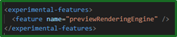
<experimental-features>
This tag allows us to opt into preview capabilities that Microsoft is testing and is not fully released. We should only be using this tag when following official documentation for a preview feature and may have unexpected results.
Here is an example of what it may look like to apply this tag:
That covers our manifest XML file and you feel confident in everything that makes up our component so far. If you want more information on any of this, feel free to take a look at the MS learn page: Microsoft Power Platform Schema Reference
That was a lot, so lets get a cup of tea before we move onto the TypeScript part of the build.
Index.ts
Now that we have a full understanding of the ControlManifest.xml file, let us take a look at the other main file for the component – the TypeScript file. TypeScript is a language that is based on JavaScript and is used to build logic for websites, apps and power apps components. In this context, it is the file that builds out what the component does, how it behaves, how it handles the user input and sends/receives the data.
The main difference between this and the previous XML file is that this file does the work that the manifest says should be happening. To continue our analogy, if the manifest file is the recipe then this typescript file is the chef that does the actual cooking.
Our .ts file is made up of nine parts:
- Import statement
- Class definition
- Private variable(s)
- Constructor
- Init
- updateView
- getOutputs
- Input change events
- destroy
Import statement

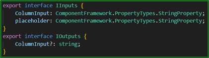
This brings in the inputs and outputs from a file that is automatically generated (with npm run build) based on our ControlManifest.xml file. For example, as you saw previously our xml file has 2 property definitions ColumnInput and placeholder, so our generated file that we are importing contains the following:
Class definition

This export statement defines the name of our component class, in this case PreambleTextField. This tells Power Apps that it is a standard control that uses Input and Output types. It must match the constructor definition in the xml manifest file.
Private variables
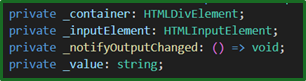
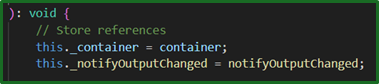
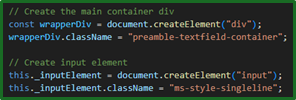
Inside this class we will define our private variables. The essential of these being the top _container, this stores the HTML container where your component will be displayed. Those afterwards are just used for component logic.
Constructor
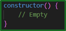
This is the function that runs once when the component is first created, before anything is displayed or initialised. It could be used to set up default internal values, logging, etc. Or it could be left empty and setup completed in the init function below.
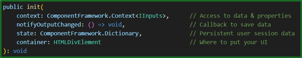
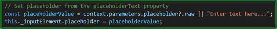
Init
This is the setup function that is called when the component is loaded into power apps, like the constructor for the UI and behaviour. It creates the initial container, event listeners, initial data and UI – so its super important.
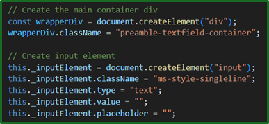
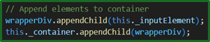
In our component, we have split it up into six main parts:
- Receiving the necessary resources
- Variable creation
- Create the user interface
- Set up event handling

- Add UI elements to the page
- Initialise with the above changes
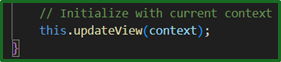
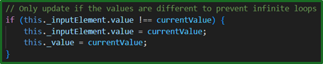
updateView
This function handles any data updates in the component, it is responsible for keeping our component UI in sync with the underlying data. We have 3 main elements to our function:
- Receive the updated data

- Update local variables with the updated data
- Update the UI with the data from the local variables
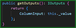
getOutputs
This function is what is called when Power apps retrieves data from your components and saves it to the underlying database.
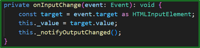
Input Change Events – onInputChange
This custom defined function is called from an event listener in the init() function when a user types into the input control. It responds to a user input by capturing the user input, storing it locally before triggering Power Apps to call getOutputs() to save the data.
Here is the event listener inside the init function:

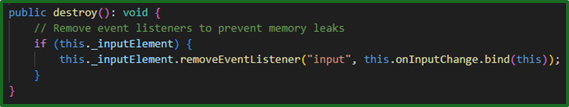
destroy
Yes, this does exactly what you think. It is a cleanup function that is called when power apps is removing or closing the component. It is best practice to use this to prevent any memory leaks as it will help towards better performance.
Styling
That’s the hard part all done! Now we just have to make it look pretty. You’re probably better than this at me, but I will run through how we can do this.
This can be done in 3 simple steps:
- Create a CSS file
- Reference the file in our manifest
- Apply the CSS class in our typescript file
Create a CSS file
CSS (Cascading Style Sheet) is a language that describes how various HTML elements should look. For example making certain elements bold with a border, and other italics.
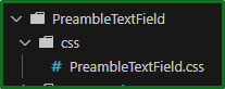
This can be created anywhere, but it is best practice to create a ‘css’ folder in your component folder and create the file there. In our case, we have created a file called ‘PreambleTextField.css’.
Here is an example of the CSS we used for our component:
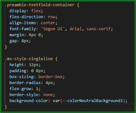
The intention of this CSS was to make it look as close as possible to the standard Microsoft text box as possible. What this CSS is showing us is that any HTML element defined in our typescript file with the class name of ‘preamble-textfield-container’ or ‘ms-style-singleline’, will get those styles applied to them. But first we need to reference the file in our manifest.
If you want to create your own CSS, you can’t go wrong using the w3 schools website to start off.
Reference the file in our manifest
This important step essentially tells the component where it should be looking to get the CSS elements when the component it used. As we’ve mentioned in our Manifest file description, it can be found in the resources section of our ControlManifest.xml file:
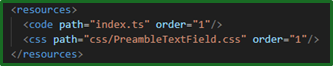
The path could include the folder as well as the full file extension.
Apply the CSS class in our typescript file
Finally, we apply our newly created styles to the HTML elements in our typescript file. To do this there must first create the element, and define the class name. This will differ slightly depending on what type of element you are styling, but will follow the same pattern:
    const elementName = document.createElement("YourElement");
    elementName.className = “Your CSS Class Name”;
The element name can be whatever you want, but “YourElement” has to be a hml element, for example:
- div
- input
- button
- label
- span
- textarea
- select
This is how we have done it in our component:
4. Deploying your component
And that’s it! Our component is built, all we need to do is deploy it. Since we have already installed all of the prerequisites in step 0, it can be done in these 6 quick steps:
- Build the component 2. Create the publisher 3. Create the solution 4. Add the component to the solution 5. Pack the solution 6. Import the solution into Power Apps
Build the component
This can be done by simply running the command ‘npm run build’ inside your Visual Studio Terminal.
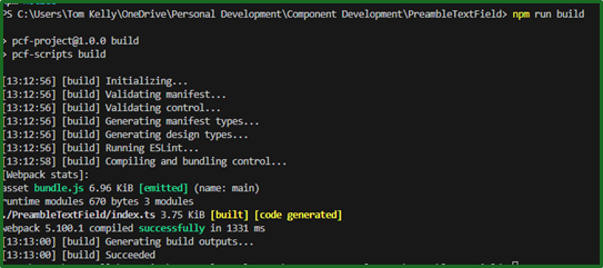
This compiles our typescript code into a deployable format. Any errors you have in your .ts file will appear at this point.
Create the publisher
Before we can create the solution, we must have a publisher. This step can be skipped if you already have one. Otherwise, this can be done by:
- Navigate to the to the power apps maker portal
- Select ‘Solutions’ in the navigation panel
- Select ‘New Solution’
- In the panel on the right hand side, select New publisher
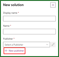
- Once created, you can cancel off that panel.
See Microsoft documentation for more information.
Create the solution
This should be done in a separate folder to keep the project clean from the solution files. Therefore we are going to create a new folder in the parent directory, then create the solution as follows:

These publisher details must match those that we created previously.
Add the component to the solution
The following command links your component to your newly created solution:

This should be done within your newly created solution folder and point to your project component we built earlier.
Pack the solution
By packing our solution, it creates the zip file that we then import into our solution, this can be done by running the following command:

This should now crate a zip file inside of your solution folder\bin\Debug.
If you have issues running the msbuild command, you can try directly referencing the MSBuild.exe as a workaround:

Though I would recommend adding it to the PATH environment variable, so that it can be used going forward. This can be done by:
- Right clicking on ‘Computer’ in your file explorer
- Click Properties
- Then click Advanced system settings on the left navigation bar
- On the next dialog box click Environment variables
- Scroll down to PATH
- Edit it to include your path to the framework (don’t forget a “;” after the last entry in here).
- Reboot
Import the solution into Power Apps
Now we have our ZIP file, all is left to do is import the solution into our environment.
- Navigate to your Power Apps Maker portal
- In the ‘Solutions’ area, select ‘Impot solution’
- Navigate to your zip file and import.
After a minute or so, you should be greeted with a notification.
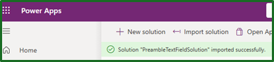
And that’s it! Our custom build component, now in power apps.
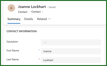
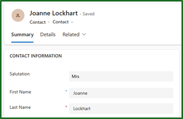
5. Using your component
Now that our component is in the system let us run through actually applying it to the fields as intended.
This is all done inside the power apps maker portal. This is done in the form editor by simply by selecting your field that you would like to apply the component to, then adding the component from the properties bar.
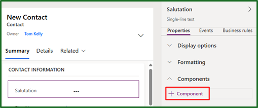
If your component does not appear in the list, try selecting ‘Get more components’.
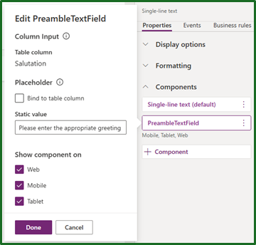
Once applied, we should have the option to edit the placeholder. These inputs should be familiar from when we defined them in our XML file.
Here is a before and after of our component, once our changes have been published.
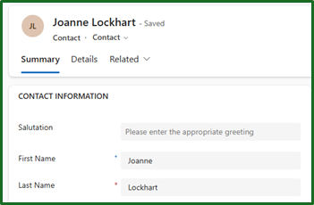
Which disappears when text is input:
6. Quick Reference Guide
Presuming you have already read the full guide and just looking back for a quick reference, here is what we need to do to build a component.
- Create project
- Create project folder
- This creates the initial component files from a template to later customise.
pac pcf init --namespace YOURCOMPONENTNAME --name YOURCOMPONENTNAME --template field
- Create our code dependencies.
npm install
- Confirm everything is working
Npm start
- Build your component
- Navigate to folder in cmd and run ‘. Code’
- Make your custom component changes
- ComponentManifest.xml
- Index.ts
- Style sheet
- Test your changes locally with the following command
Npm start watch
- Deploy your component
- Compile your typescript code with the following command
Npm run build
- Create solution folder
- This should be done in a separate folder to keep the project clean from the solution files.
- Create the solution
Pac solution init --publisher-name “TomKelly” --publisher-prefix “tk”
- Add your new component to the solution
Pac solution add-reference --path “..\PATH TO PROJECT FILE\ProjectFilename.pcfproj”
- Build the solution zip
Msbuild /t:build /restore- Can be found at
\bin\Debug\
- Import .zip file into Power Apps
- Compile your typescript code with the following command